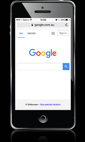
1. More people are now using mobile devices than laptops and desktops.
1. View your website on a smart phone or tablet.
Okay let’s cut to the chase and get the word straight from the horse’s mouth: recently Google came out and said on its own blog:


Okay let’s cut to the chase and get the word straight from the horse’s mouth: recently Google came out and said on its own blog:


This was the day when Google said it would begin to favour mobile-friendly, responsively designed websites over non-responsive, non-mobile friendly websites.
And herein lies probably the most important reason for your business having a responsively designed website – your Google ranking and organically sourced traffic.
The number of mobile-friendly sites amongst the top 10-20 search results (page 1 and page 2 of Google) is steadily increasing as Google “tweaks” their search algorithm to favour responsively designed websites. As increasingly people search for your products and services “on the move” optimising your site for different devices is becoming more and more critical.
Consistent and positive user experience has a positive impact on your sales conversion rates because your customers are familiar with your website’s navigation across all devices.
For example, they initially find your website on their mobile phone while sitting on the train on the home from work. They’ll browse through your products and decide what they want, but they’ll probably complete their credit card purchase while relaxing at home from their iPad.

Back in the ancient history of mobile-browsing (around about 2008) it was common to type in the URL of a website and then be redirected to a mobile version of the site. The mobile version was just like having a second website with it’s own analytics, maintenance and of course cost of building the thing to start with.
Now with responsive website design there is only the one website that does lots of great things – but above all provides a positive user experience to your customers whether they’re on a Samsung mobile or an Apple iPad Mini 2.
Because a responsively designed website works well and looks great on almost any size screen, you’re effectively “future proofing” your website. Responsive design means that your website “responds” to the device that is viewing it immediately and seamlessly.
Once again, responsive design delivers the most positive user experience for everyone visiting your site. Now and into the future.
Related Tag: Web Design Melbourne