Is your Website Mobile Friendly and Responsively Designed

Responsive design means that your website not only looks great on any smartphone...

by Jessica Richards - Business Development Manager
Is your Website Mobile Friendly and Responsively Designed

Three Simple Ways to Test if need a Responsive Website

1. View your website on a smart phone or tablet.

Seems like an obvious test right? But you’d be surprised how many people don’t look at their own website on different mobile devices. Probably for fear of what they’ll find!

Try out the following devices:

Do you know what percentage of your audience is visiting your website on a mobile device

If your website is not responsively designed, have you ever wondered what percentage of your target audience is visiting your site on a mobile device?

Go to your Google Analytics account, and click on:

  • 1 Audience
  • 2 Mobile
  • 3 Overview

blog-internal-black

(tablet)
In the above example we’ve got:

  • 38.21% (mobile)
  • +
  • 11.84% (tablet)
  • =
  • 50.05%

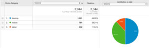
That’s 50% (!) of your potential customers arriving at your website and having a negative user experience! And that’s definitely not good for your business.

If you got anywhere close to, or over 20%, you’ll need to accelerate your website’s migration

{ ?>

Re-size your browser window to see how your site “collapses”.

Click and drag the bottom right-hand-corner of your browser to re-size your window. As you do, watch what happens to your website, does it…?

A) Collapse on itself and it all looks like a jumbled mess?
B) The images, menu and buttons line up nicely and still make sense no matter how you size it?

If you got “A” then your website is definitely not responsively designed.

If you got “B” then your site is responsively designed and you can get on with growing your business!

Need more convincing?

Related Tag: Web Design Melbourne


Read our next article:

You have successfully signed up for our newsletter.

ok