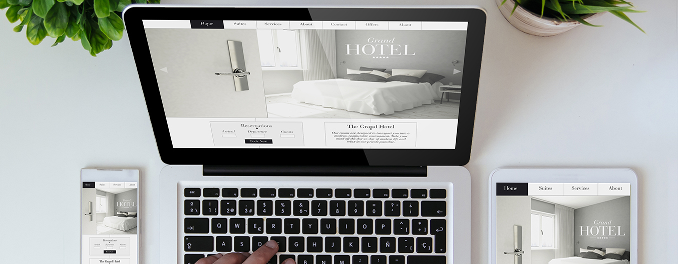
Responsive web design and development

Have you ever opened up a web page on your mobile phone or tablet, only to experience instant frustration when the page didn’t fit on your screen and you couldn’t properly view the content?

by Natko Radmilovic - Art Director
Responsive web design and development

Have you ever opened up a web page on your mobile phone or tablet, only to experience instant frustration when the page didn’t fit on your screen and you couldn’t properly view the content? Although users across the world prefer to view the web via multiple digital devices, many companies are still resistant to making their websites mobile friendly. Even companies that understand the need to be mobile-ready and develop mobile-optimised sites often do it halfway, creating mobile sites with limited content and features.

Related Tag: Web Design Melbourne

This is exactly the kind of thing that drives users away and makes them reluctant to engage with your product or services. Luckily, responsive web design makes it easier than ever before to create a single website that is accessible on all devices: mobile, tablet, laptops and PC. Instead of developing separate versions of the same site to optimize for mobile and tablet, responsive design automatically adapts your content to any screen size. This means you’ll be able to satisfy all users with a single web design.

The Backbones of Responsive Design

How does responsive web design work, anyway?

In the old days, web pages were created with a set width and height, based on the number of pixels. Because the size of the page was predetermined, most of the page would appear off-screen when viewing on a smaller device.

Instead of this old school method, responsive design uses elements that automatically resize into different grids based on the size of your screen. If you are viewing the webpage on a large laptop screen, the grid will display with a wider array, taking up the full width of your screen.

When viewing on a tablet or mobile device, the grid will stack vertically, so all the same elements that you saw on the right side of your laptop screen appear on top of one another like a tower of building blocks.

This responsive layout ensures that every part of your website will be displayed to the user.

Layout Design Customisation

Some companies may feel that it is unnecessary for all elements to be displayed on a mobile device. Responsive design also allows you choose which elements to include and which to exclude for a better mobile design.

Through customization, business owners will find that they can provide their customers with the optimal user experience. Less important elements like ads can be removed, letting users focus solely on content.

Digital Pieces

Are you ready to take the next step in the future of digital and revamp your mobile design? We can create brand consistency across all your digital touch points by developing a responsive website for your company. Go mobile. Get in touch with us.

You have successfully signed up for our newsletter.

ok